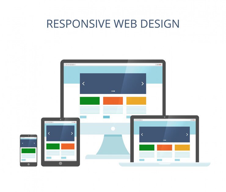
Your Website, Optimized for Every Screen
At Monitech Service, we specialize in responsive website design that ensures a flawless user experience across all devices. In today’s mobile-first world, your website must adapt seamlessly to smartphones, tablets, and desktops, keeping your audience engaged no matter where they browse.
Our expert team crafts visually stunning, fast-loading, and highly functional websites that maintain their design integrity and usability across all screen sizes. Whether you’re a startup or a large enterprise, we tailor every aspect of your site to deliver optimal performance and maximum engagement.
- Built to drive user actions and business growth.
- Intuitive layouts for a smooth user journey.
- Enhanced visibility for better search rankings.
Optimized for Speed, Built for Visibility.


Flexible Design
Adjusts effortlessly to all screen sizes, ensuring a seamless user experience.


Mobile-First SEO Advantage
Designed to boost search rankings with a fully responsive structure.


Lightning-Fast Load Times
Optimized for speed to enhance performance and user satisfaction.


User-Centric Navigation
Smooth, intuitive browsing for improved engagement and conversions.
Flawless Performance, Any Device, Every Time.
At Monitech Service, we design responsive websites that ensure an outstanding user experience on all devices. With mobile usage soaring, your website must adapt effortlessly to smartphones, tablets, and desktops.
Our expert team crafts websites that are not only visually appealing but also highly functional, offering smooth navigation and quick load times. A responsive website means better SEO rankings, higher conversion rates, and increased mobile traffic—all essential for business success.

Blazing-Fast Performance
Quick load times for a smooth browsing experience.

Effortless Adaptability
Optimized for all screen sizes to maintain consistency.


